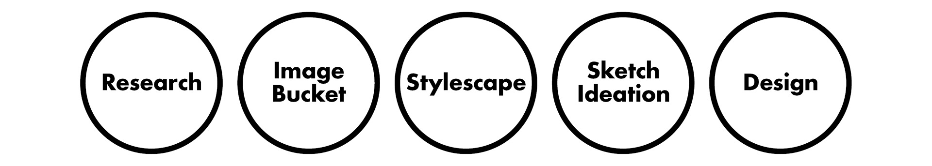
For this project I uses Chris Do's suggest design process.
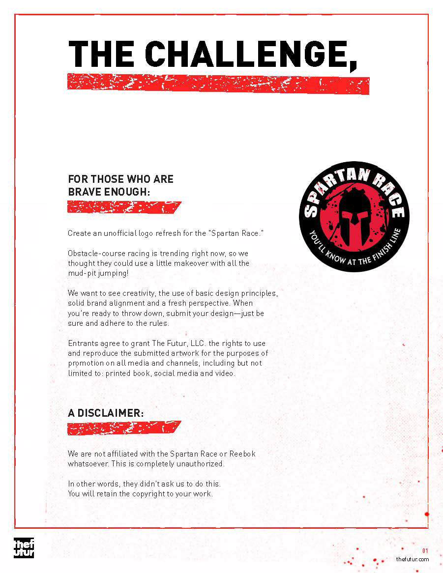
The Brief.

Research.
When I began this project, all I knew about the spartan race was that its some sort of elite obstacle course. Through research I learned that the race is one component of the brand. There are a variety of products under the brand. More importantly, it is a philosophy for self improvement through training and discipline.
The use of the Spartan imagery in their branding is a metaphor for this. What the identity needs is something that can symbolise this instead of a image of a literal Spartan.
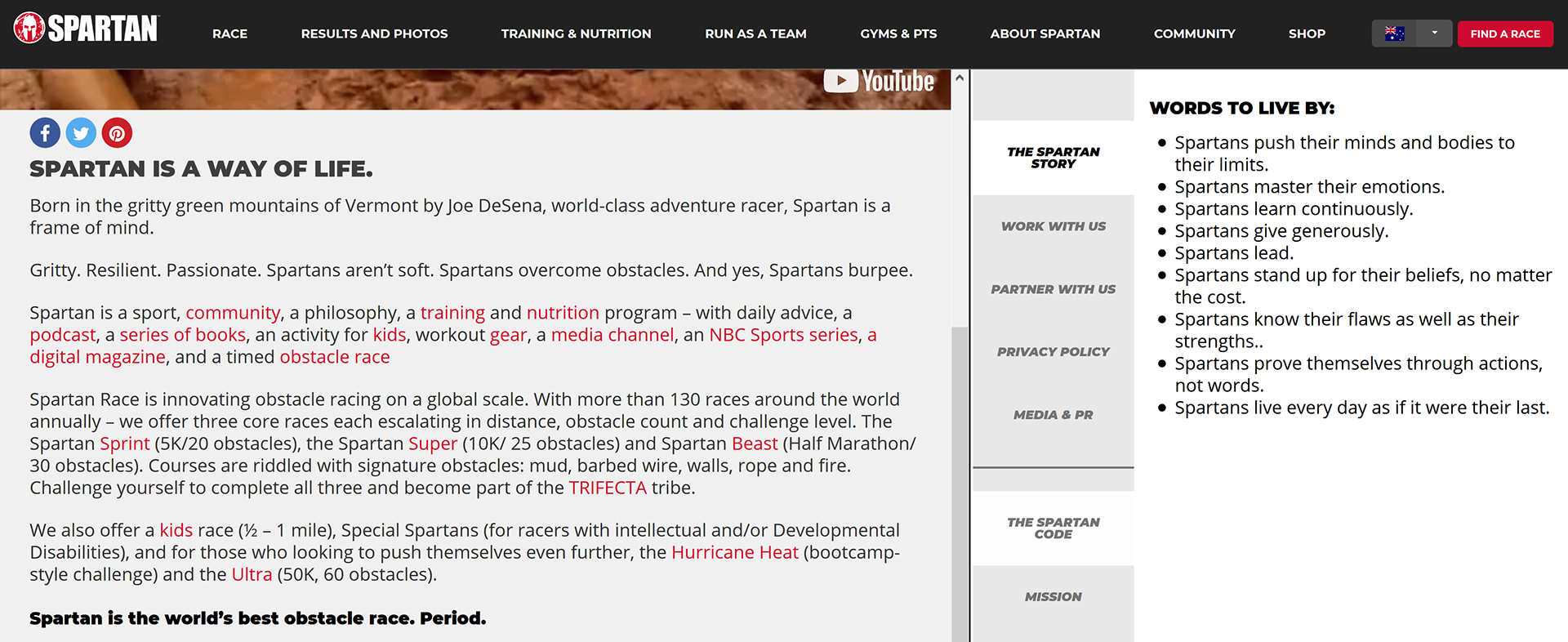
Image Buckets.
5 visual areas of research: Spartan mythology, The Spartan Race, Mud races, Constructivism and Shepard Fairey.

Stylescape.
The brief only stated to apply the logo to a t-shirt. I kept in mind that this logo will have to work on a variety of brand applications.
Key values of the Spartan Race brand:
Strength, Challenge, Active, Forward, Lifestyle, Unbreakable, Gritty
Typeface.
DDC type was chosen as the hero typeface as the branded needed a font that had industrial strength, worked when displayed large, and robust enough to look good if it was damaged

Sketch Ideation.
I explored some design ideas and came up with 4 solid ideas.
1. Spartan concept
2. Superman S concept
3. Lambda with homage to vintage Reebok branding
4. Lambda concept


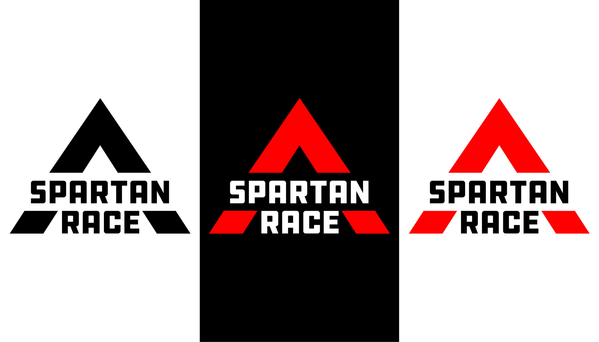
Design.
After posting on Instagram, my lambda design was my strongest concept and further developed. A major design decision was to the removal of the damaged textures. I felt that the logo did not need a distress texture because:
1. Many applications of the logo will damage it creating organic textures.
2. In context with other brand applications it will inherit the values that distress texture signifies.
3. More flexibility with other parts of the Spartan Race brand.
I felt it was unnecessary to apply a texture so I decided to keep it clean. I focused on creating a logo that was readable when damaged.